 |
| Where the Fat Cats Are |
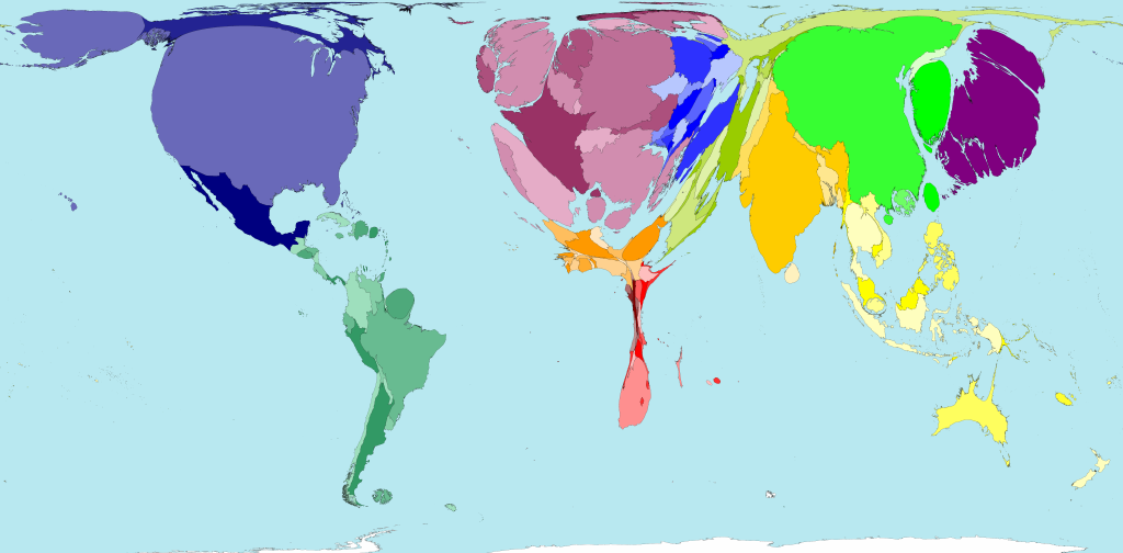
The map of world wealth
This is a map of the world weighted not by land mass or navigation
lines but around how much wealth each country has. As you can see, North
America and Western Europe balloon to enormous proportions — even after
adjusting for purchasing power, 46 percent of global wealth in 2002 was
in their hands. The horror of this map is the shrunken husk of Africa.
That’s a lot of people living with very little.
No comments:
Post a Comment